The New York Times has a very nice graph on income instability (source):
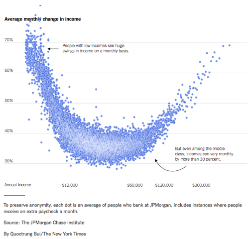
This is relevant when it comes to investment in housing, I suppose. If your income is low and very volatile, then you can only afford to take out a loan if there is enough credit to bridge any gaps in income that you might experience. Of course it would also be interesting to disaggregate the data somewhat. Do these swings affect most people in those income classes or almost none, with those experiencing swings of income seeing very large changes in income? It would also be nice to see a distribution of income changes that makes clear whether these are increases or decreases. I have the slight feeling that the data above would not “smile” at us if we would take that into account.
It is often forgotten that economic well-being is not only about having a sufficient income, but also a stable one. With labor market deregulation, instability might have increased so that those in the lower income brackets are not able to enjoy their income but instead are saving as they seek to bridge any potential income gap in the future.

Leave a comment